Thursday, June 29, 2006

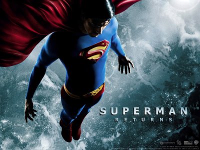
Superman Returns (The Remake!)


SUPER-SIZED SPOILERS!

I'm cereal, you guys!

I mean it!

If you haven't seen Superman Returns yet, go do your patriotic duty as a tax-paying American and buy yourself a ticket! Enjoy the movie and come back later to read my fanby nonsense.

Everybody who hasn't seen it gone?

Good!

Here we go...

So I saw Superman Returns today and it was good, if not nearly a complete remake/sequel of sorts of the 1978 Richard Donner Superman. Bryan Singer pays homage to the great Donner by lifting lines and entire scenes from the first two Donner movies. Brandon Routh is pretty good when playing Clark Kent (he's trying hard to mimic Christopher Reeves' mannerisms) and okay as Superman. Nobody is ever going to inhabit the character of Superman as much as Reeves did and you can't hold that against Routh. Them's some big red (dark brown?) boots to fill! There is a lot to hold against Kate Bosworth, however. She's totally miscast as Lois Lane and out of her depth as the worst mother ever (count the times she endangers that kid!), a reporter (Kent and Superman both return after a five year absence on the exact same day? Yeah, right!), and a wife/domestic partner of Perry White's nephew? Since when did Lois have to sleep her way to the top? She wouldn't let Superman help her get a story, let alone Cyclops! She was all about making it on her own! I think it would have been funnier to cast Margot Kidder again as Lois, since Superman pretty much never ages (up to a point) and he's been gone five long years, Lois has fallen on hard times and not aged so well (all those cigarettes she smokes, remember?) But that would be a whole different movie, more like a remake of Harold and Maude. Speaking of casting, am I really supposed to take Kumar seriously as a henchman? He distracted me from every scene he was in.

The movie hits all the notes I loved in the first Superman, but it never really breaks any new ground. You've kind of seen it all already. Although this time around, the special effects are better. I just wish the story was. Kevin Spacey as Luthor starts off goofy (when he makes the dying widow sign over her fortune over to him) and then becomes a real threat (when he gets his hands on Kryptonian technology). If Luthor followed thru with his hatred of Superman for not sharing his technology, that'd be great. He'd have both solid motivation as a more complex villain and the tools to make himself a legitimate threat to Superman. Sadly, Luthor isn't smart enough to do anything cool with all that supposed knowledge and technology, just build an island with it so he can "wait for it.." sell some timeshares! WTF? Since when was Luthor into real estate? Actually it kind of makes sense, I bought a house a few years ago, and let me tell you, those real estate guys are pretty evil! Luthor has become a great villain in the comic books, but I never liked the hammy Gene Hackman version (mmm, ham...) and Spacey's version is more of that. He even has the ditzy girlfriend/comedy relief again. But no Ned Beatty, sadly. Maybe Kumar was meant to be the new Ned Beatty character, but his comedic scenes got cut? Who knows...

Questions are never answered:

1. Why doesn't/didn't the world need Superman? And why does it need him now? Even Lois came up snake eyes on that one. That should have been the theme of the whole movie!

2. Superman's trip to Krypton or what remained of it sounded interesting, but they glossed over it, saying "it was a graveyard." I thought they were going to tie that up somehow? Someone told me in the novel, Luthor is the one who planted the reports of Krypton in the papers, thus getting Superman to leave and go see it for himself. If it was filmed, it got cut in the theatrical release.

3. I think Singer is going with the premise of Lois NOT knowing Clark is Superman? There's the scene where he drops his glasses when she drops her purse and he almost looks like he wants to tell her? I couldn't tell for sure. Just like I couldn't tell for sure what year it was. The opening scene with the dying lady looks like the 1940's, Metropolis and Clark Kent's suits look like 1978, everything else looks present day? I'm pretty sure it was supposed to be present day. Which is funny, because nobody really reads newspapers anymore, do they? If Superman DID return, it'd be on The Drudge Report or CNN before newspapers ever got the story. Lois should have moved on to blogging or pod casting!

Plot holes abound:

1. Kent and Superman both return after five years on the exact same day? No one notices that? Clark gets his old job back (because someone died?) and a cake from Jimmy. But no love from Lois? Damn, that's cold...

2. Luthor's plan is goofier than The Joker goofed up on goofballs. He builds a new island with the intent to sell property there. If he sinks pretty much the entire United States as he says he will, won't the world economy go down the toilet? I know the dollar is weak against the euro right now, but come on! And if another country really wanted the new continent, they'd just take it by force. What army did Luthor have? Besides the kid from Harold and Kumar go to Whitecastle, I mean? All of five guys? Six, counting the dog?

3. The kid. The Son of Superman. I'm so torn on this development. This opens a whole new can of worms. Bucket of beans. City of Kandor. Whatever. We now have a half human, half Superboy in the works, which is kind of lame. We've already seen a young Superman, and we know how that story goes. Shouldn't they have saved this for when Routh is ready to retire the role? I know the whole theme was fathers and sons, adoption, etc. But what are the implications of this? Superman is a now deadbeat dad? He didn't pay child support for five years! The kid gets beat up on the playground and says my dad can beat up your dad? Comedy abounds...

4. So at the end, we now have a growing "New Krypton?" Or just an asteroid? Just add water! "Like Sea Monkeys," Parker Posey said. There's more, but it hurts my head to think about all of them and this post has gone on longer than the actual movie...

And Superman drinks Bud? WTF? I'll bet he's a NASCAR fan, too...

Having said all that, there is plenty to enjoy. It's still a good movie, just not a great one.

Great scenes:

1. Superman walking into gunfire and the close-up of the bullet bouncing off his eye. Fredric Wertham would not have approved!
2. Superman catching the falling globe of the Daily Planet in the Atlas pose. Or is it the Van Halen 51/50 pose?
3. Clark changing into Superman in the elevator shaft. Now THAT'S cool! Not that many phone booths around these days.
4. Luthor dropping a quarter or whatever it was into the $10 Suggested Donation Box at the museum.
5. Jimmy Olsen getting scooped by a kid with a cell phone camera. And a homage to the cover of Action Comics #1, no less!
6. Superman recharging in the sunlight and breaking thru the clouds on a ray of light.
7. All the scenes of Superman is space are awe-inspiring.
8. The dog eating the other one to survive!
9. Superman leaving an impact creator when he comes after Luthor.

I'd still have to give it an 8 on a scale of 1 to 10. I love Bryan Singer, but his Superman is not nearly as good as his first two X-Men movies. Although this does explain what happened to Cyclops in X3. He ditched his ruby quartz glasses and went off to common-law "marry" Lois Lane. So there!

Friday, June 23, 2006

Whose Side Are You On?

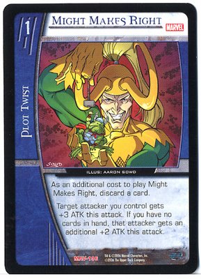
Loki: The Final Card


...and the final card! So there!

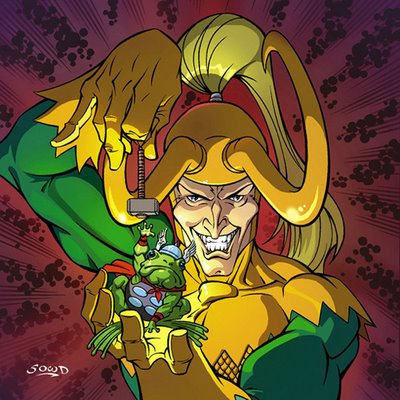
Loki: The Colors


So once again, Dean White hooks it all up with a masterful coloring job! He does a great job of lighting the scene and drawing the viewer's eye directly to the froggy Thor. So there!

Loki: The Inks


Here's the final inked version. I'm never 100% happy with my inking (it's always easier to ink other people for some reason!) because I set out to do that dead line weight style on this piece. It never looks finished to me, though! I have to sit there and overwork it to death. I have a lot of respect for guys like Rob Haynes and Dusty Abell for pulling it off so well. So there!

Thursday, June 15, 2006

Loki: The Sketches


So what's more fun than getting to draw Loki the Norse god of mischief? Loki the Sly-One, the Shape-Changer, the Trickster, the Sky Traveller, the Lie-Smith, among others (thank you, Wikipedia!). Not much! He's always been one of the best bad guys around, I loved the Walt Simonson and Arthur Adams versions of the character as a kid. So while still attempting to keep it in a simple Rob Haynes type of style, I set out to capture the elements of Loki I loved as a kid. I like the idea, it's simple and suits the character perfectly: he's turned Thor into a frog (from the legendary Walt Simonson run) and he's dangling Thor's hammer over his head, torturing him. It's something we've all seen a little kid do: torture a small animal or insect in some way. It just cracks me up that an immortal Norse god like Loki would stoop to such a petty and immature devices. So I feel my basic idea was strong. So there!

Saturday, June 10, 2006

Yet More Random Ramblings...


So what do I do in my non-existent free time? Interviews! Lots and lots of interviews. John Ortiz over at tapthetalent.com recently interviewed me for his site. You can read it here.

Abdulkareem Baba Aminu at komikwerks.com wrote an article entitled Taking Over The World With Aaron Sowd! You can read my first Komikwerks interview by G. Willow Wilson here. Komikwerks also hosts The Rants Column, a weekly guest column where they allow folks to spout off about any and all things comics. Comic books in America these days tend to be stereotyped as strictly superhero (TM and copyright 2006 Marvel and DC Comics) in content. You can read my rant about the superhero stereotype vs. the reality of growing diversity in American comics entitled Pow! Comics Aren't Just For Superheroes Anymore!

Sean and Christina Parsons at roughhouseink.com have conducted artist interviews with a bunch of professional artists in the business and collected them on their very informative site for comic book inkers. You can read mine here.

And from toptwothreefilms.com: "What is a comic book? How has the use of computers changed the creation process of print comics? Should webcomics be created in such a way that they cannot be sold as books? When does a webcomic stop being a comic and enter the realm of animation? Can webartists live from their work? These are some of the questions we try to answer in Adventures Into Digital Comics, a documentary film analyzing the events that changed the comic book industry and art form over the last decade. Investigating the work and ideas of established and up and coming comic artists, director Sébastien Dumesnil offers the audience a vision of the future of a rapidly evolving medium. The film opens a window onto the dynamic renaissance of the comic taking place today on the web, exploring the obsessions and passions, not to mention the ever present struggle to survive, of the artists behind the images." My interview is here.

So there!

Friday, June 02, 2006

Green Goblin: The Final Card


So what did the final card end up looking like? See above! It works pretty well, I think. The image printed so small, and I knew it would, but it reads clearly and tells the story. That's why I set out to do such a simplified style in the first place. All the tiny little details I was agonizing over earlier in the inks (like his scales) barely even show up. What's important is how it works as a whole. So there!

Green Goblin: The Colors


So what could possible save my art at this critical stage? Why only the best damn colorist in the world, of course! That would be one Dean White, good friend and frequent collaborator. Dean brought it all together and really saved the piece in my opinion. I was trying to play up the insanity of the Green Goblin in the way I exaggerated his face, almost to the point of the Joker. The way Dean has the fire from the pumpkin bomb flickering off Green Goblin's face highlights that perfectly. The moon and the clouds in the background set the mood for an eerie scene. Saved by the colorist! So there!

Green Goblin: The Inks


So what could go wrong with the simple Alex Toth School approach? More specifically, the Rob Haynes style I was attempting to emulate? Well, lots, actually! It started off pretty good in the sketch phase (although it's probably not as dynamic as Rob would have done) but the inks are where I lost it. Since I worked as an inker for years and years I am physically incapable of putting down a "dead" line like a Rapidograph makes! I can't do it! I tried starting off that way, but I always have to add line weights and variation! Argh! So it's hard for me to ink like Rob, with no line variation. Also, the scales on Green Goblin might be a bit much detail? Hard to say. I tried to just hint at them, but got a little carried away. He doesn't look right without scales, even in this more simplified style. Maybe the colors can save it? So there! I hope!

Green Goblin: The Sketches


So what can you do with the Green Goblin that hasn't been done before? Not much! Especially when he's on his glider, since his feet are locked into position, you're kind of limited in his poses! John Romita will always be the classic Green Goblin artist in my mind since I was too young to see the original Steve Ditko version. Ditko was such a genius when it came to designing characters: all those original Spidey villains are so iconic. Ditko was a master at incorporating the essence of each character into their appearance.

So I wanted to capture that classic look of the character, the redesigns of his costume never did much for me. Although the Hobgoblin was a great variation! I loved that Ron Frenz run! I set out to push my style in a more simplified Rob Haynes direction. Rob is so good at doing so much with a minimum of line and rendering. It's that whole Alex Toth School of "less is more" and it's actually very hard to do! Mike Mignola is a genius at it. Rob Haynes and Dave Johnson both do it masterfully. Me, not so much! I want to render the hell out of everything and that doesn't always help! Geoff Darrow once told me the reason that he puts so much detail into his work is to cover up the fact that he doesn't know how to draw very well! That's not true, of course in Darrow's case, but I often find myself falling into that trap. So since these were going to be tiny trading cards, I thought a simple strong composition would serve me best. So there!

Bring on The Bad Guys!


So what you need are more action figures? Still have uncluttered space in your office cubicle? Not enough HeroClix to cover your entire studio apartment or Fortress of Solitude? The new set of Marvel Legends Series 13: Onslaught just came out and the set of six characters includes The Abomination, Blackheart, Green Goblin, Lady Deathstrike, Loki, and Pyro. The reason I mention them is that four of the six figures: Blackheart, Green Goblin, Loki, and Pyro (pictured above) come with free Upper Deck Marvel Vs. cards drawn by, you guessed it, me! Check them out at your favorite toy store or comic book shop!

According to Toy Biz: "This Bring on the Bad Guys Series includes some of the most deliciously diabolical villains in Marvel's library. Collect all the figures in the series and you'll build yourself your very own, deluxe–articulated Onslaught – the greatest threat the X–Men have ever faced! Build your own 8" Onslaught" So there!